Thursday, 19 November 2009

Digipack

What is a promopack?
What is a digipack?


What is a Digipack
Digipaks typically consist of a gatefold (book-style) paperboard or card stock outer binding, with one or more plastic trays capable of holding a CD or DVD attached to the inside. Since Digipaks were among the first alternatives to jewel cases to be used by major record companies, and because there is no other common name for Digipak-style packaging made by other companies, the term digipak or Digi-Pak  is often used generically, even when the media holder is a hub or "Soft Spot"  rather than a full plastic tray.
Digipak-style packaging is often used for CD singles or special editions of CD albums and the tall DVD Digipak (DVDigipak)  is used as a premium package for DVDs and DVD sets. Because such packaging is less resistant to abrasion than jewel cases, it tends to show signs of wear relatively quickly. Licensed digipak manufacturers such as domestic U.S. printer and disc replicator Oasis Disc Manufacturing recommend coating the raw printed paper with a protective UV coating, thus ensuring greater longevity. - http://www.wikipedia.com/
Promo Pack
A promo pack is a running theme or collection of ideas that the video and digig pack share witch can then be transferred in to all aspects of the artists identity at this time to enhance the theme that is trying to be created. For example:
Britney Spears used the theme of the circus for her come back album in 2009.


This first image is from Britney's online ticket booking website www.virginmobile/britneyspears.com the theme she initially obtained with the extravagant circus and production elabouration is carried through on to the website. The font and the image of the stage enhance this feel and create an ongoing premise.


This next image is the cover of Britney's album entitled 'circus' She retains her glamorous side taht is known to the public, but also encouperates elements of the circus design, includig the stars around the edges and the red curvy lettering pronouncing her name.


This picture is a set from her tour, 'The Circus' - The choices of set style and mise en scene is evident in this also with use of the cage, once again to emphasise her promiscuity but use of something that is also commonly found in the circus - ( the cage for lion taming)
This final image is a still from her video for the song 'circus'. The theme has also flowed through in to this with the props symbolic of the circus atmosphere.

Analysis of digipacks
The Killers - Greatest hits

 Colour
The colours used on this digipack cover are made more visually appealing through the use of one another. The black encourages the pink to stand out and gives it increased deffinition and the pink text assists the black background in defining the image below, whilst also creating a more subdued and interesting effect.

Typography
The text is written in 'The Killers' trademark font whilst the album title 'Greatest Hits' is written in a more simple font to attract the attention to the bands name. The text is also used to divide the page in three, a suitable and attractive layout for the eye, with the album title dividing the image and the band name.
Image
Typical of 'indie' style the band are the main focus of the cover dressed and positioned in typical 'indie' ways. The fashion is eccentric, fur coats, braces and waist coats are worn exaduarrating the authenticity and individuality of the band. their close allignment and subdued looks create the stereotypical expectations of this subculture. 

Analysis of digipack
Jamie T - Kings and Queens                                      

Colour
Jamie T, another 'indie' artist also uses an 'abstract ' approach to his digipack cover using multi colours ina repettitive fashion. The image is also enhanced with a form of sepia editing and solarisation. This heightens the colouring and makes the block colours of the image look bolder and more prodominant. 

Typography     
The text of both teh artists name and the album title are written in a circular reppetative fashion revolving round the central image of a camera shot. This circular patterning creates multiple aspects of the cover and represents the variations of dimentions the genre posses and the different aspects of music the artist presents.

Image
The image is a projection of a visual through a 'fish eye' lens. It presents a distorted image of two people in a suberban area, directly in relation to the circular pattering of the text the image creates an overt dome shaped perpective as if intended to seem as if you were looking from the ppint of view of somebody elce.
                                                              
Flat Plans
Initial Designs for Digipack


Photo evaluation


The cover for my digipack recreates the initial ideas I had to incorporate light effects into my video. I have taken a photo in a high definition on a SLR camera. I did this as I wanted to create images with an intense feel to them and I feel I have achieved this with a high level of detail in each picture. In my cover image I have increased the depiction of the sparks flying of the sparkler. I decided to use take the photo of someone playing with a sparkler, as when captured on camera at a low shutter speed the light from each movement is retained and this recreates the effect of travelling light which initially, we wanted to carry out in the video. The second image was assembled in a procession I saw. I took various shots of this and then cropped this particular segment of the picture to capture the burning crosses, which I thought appropriate as I thought of this image whilst listening to the song. The underlying protest theme of war throughout the song is particularly evident and I worked with this to depict an image of anger or violence in a subtle way. The third image of the burning flames was composed for the segment of the digipack behind the compact disk holder I wanted to keep this image simple but retain the dark, light contrast being constructed throughout the rest of the pack. I also think the inside of the inlay will look good together with both images of burning present. The final image is also similar to the cover shot as it involves the same aspects of travelling light, yet again created with use of a sparkler. This segment however I have heightened in brightness as it is to hold the track list in a centre position on the page.

Typography
I Carried on the simple typography usually used on Bloc Party’s Flyers, adverts and CD Covers and have used a mix of text sizes to create some sort of interest to the eye. On all the photos where I have used text I have kept the same font style as not to make the digipack look messy. I used a standard Calibri body font as previously said because it was the same as the font used in other Bloc Party items of advertisement. On the track list I used a variation of sized texts as I thought this was a more interesting approach to designing it. On the second image I have used an orange coloured text as I could not black as I had done previously which would clash with the dark background. However it sit comfortably amongst the fiery composition of the picture. I decided to write the name of the band on all viable dimensions of the digipack as I felt images alone would have seemed bland and although the text is repetitive it is true to form of the band themselves to feature this style of replication. As seen in the image below:
I also recreated a true to form style digipack by listing the bands existing song tiles of the back to create some form of authenticity to the CD pack.
Further editing of Digipack
I used photoshop to try out a variation of editing effects and found one that I think would appeal to the target audience. I have used the effect of 'solarisng' to create a neon, appearance.

However I do not think that the typography is visualy appealing so I will experiment with lighting effects in photoshop to create a more accessable and readable title.

Completetd Digipack


Thursday, 12 November 2009

Development of Ideas - lighting/set/costume

Lighting:
We want to use a neon light effect to keep a dance feel to our song. Although it is quite an aggressive song the rest of Bloc Party’s music is very much within the dance scene and we have to take aspects of this and incorporate it within our video. We want to make projections on to a black screen and use lighting to make the dancers featured within our video look unreal.

Lighting influence's from videos:
Links:


http://www.youtube.com/watch?v=9Jq42-HY8-g

Projections:
Here are some photos we have taken for inspiration. We think this will intensify the spooky but aggressive image the song portrays.


Below are also images of Hellingly Hospital where, initially we were going to film, however it has now been closed and we are unable to do so. The pictures will however, give us an idea of the style and structure of the ones we will need to take for the projections we will be using.The collaboration of images all share the spooky effect we are trying to achieve, using various techniques including lighting and positioning effects.

We went to the industrial estate in Lewes to try and create some photos to use as back up projections if we couldn’t get to Hellingly. Although the images were not exactly what we wanted for our video, we can now transfer them over to acetate and project them in the shoots with our dancers. We have recently recieved permission from the owners of the warehouses to use the premises as a filming set. We had to go there to speak to the security gaurds before we were granted this and go through certain health, saftey and hazard risks. If we do deside to film here, we will have to contemplate all the potential risks involved and make sure that we have thaught thoroughly through ways to evade any complications and problems that might occour.The following images are ones we took personally that may feature in our video:

If we do deside to use theese images we can use programmes such as Photoshop and Indesign to add effects to them to create our desired appearence, for example highlighting the red tint to them, emphasising the symbolic references to death, blood and danger, or putting them in to a sepia tone, thus creating a more distorted and unusual effect to them. These images provide us with a basic vision in to what we need to do.
Location: Ideally, we want to film in a big, abandoned area. Somewhere with a lot of space that creates the spooky image that we are looking for to match the theme of the song. We will also be filming some scenes in a studio where the dance routine will occur in front of a black backdrop.

Summary Of Key Idea's Sofar
 Costumes: The dancers will be wearing black jumpsuits with neon lights attached to them. When they perform their routine in the studio, the neon lights will blur to create an abstract look. When filming in the abandoned area/ building, the man will be wearing trousers but will be topless to enforce the actor’s masculinity, however our choices of trousers will be specific as we have now defined the target audience.


Mise en scene: Within the dance routine, we do not want any other props as we want the main focus to be on the dancers and the abstract look they will create with the lights on their costumes. Within the chase scene in the building, we want to use as many spooky props as possible. Anything that is already within that building we’d like to leave in as it would intensify the spooky image we are trying to create as most of the things left will be decaying.


Narrative: The dance routine within the video is something we wanted to add in as wanted the video to have an abstract element. The actual narrative of the video is about a man being trapped in an abandoned building, sending himself crazy. We will enforce this by projecting weird and distorted images on to the set and using a variety of camera angles

Tuesday, 10 November 2009

Bloc Party's Image

Bloc Party’s image also follows this ‘Indie’ look and much of their fashions are focused around this. This will help us design costumes that are appropriate for the band. Below are some images of Bloc Party which we will use as inspiration for our own costume designs.

In this photo there are logos and brands on the members clothing which are also included within the ‘indie’ stereotype – including the ‘All Stars’ Converse T-Shirt and the preppy college ‘Wildcats’ T-shirt


Why we chose the song and it's demographic

Why we chose the song 'Ares'
We decided to chose this song as initially as it had no current or official music video to it. After we looked in to a selection of various songs we decided to go with this one. As a group we thought that this song in particular was one that had a strong underlying protestant theme of war which we could use a central point in which to develop ideas from
.BLOC PARTY'S DEMOGRAPHIC
After doing research in to Bloc Party’s public persona it was apparent that there is a specific image associated with the band that was a necessity to maintain. The following articles, clips and images summarise Bloc Party ‘s image and will be reflected in the video we will be making.

To understand the portrayal they already obtain we looked at different media appearances that band made and how they were presented in each, this includes interviews, magazine features and public appearances. The chart below is a representation of data produced through research ,found whilst trying to distinguish Bloc Party’s demographic.


DEMOGRAPHIC RESEARCH (THROUGH MAGAZINE APPEARANCES)
Looking at these examples of publicity features we can analyse the demographic for Bloc Party. We have made reference to www.nrs.com to analyse the target audience and demographic of each magazine;


NME
Based on an analysis of 12 months according to the data 296,000 men read NME on a weekly basis which is 1.2% of men reading magazines in total alongside 19,000 or 0.4 % of woman readers every week. 1.4 % of these readers are aged between 15 – 44 leaving the 0.2 % of 45 years + reading the rest. 137,000 of the downmarket audience read NME which is 0.6 % of C2DE readers compared to 250,000 or 0.9 % of ABC1 readers.

GAURDIAN
They also featured in 'The Gaurdian' newpaper however I could not include the image, but have placed the www.nrs.com analysis of their demographic below:
The music clip is from www.gaurdian.co.uk and is the remix of Bloc Party’s ‘Ares’: we looked into the breakdown of readership in to the Guardian newspaper – making similar assumptions of the online newspaper version. 503,000 women or 2.0 of all newspaper readers, read The guardian on a regular basis, overtaken by 703,000 male readers or 2.9% everyday.615,000/ 2.5% of these people are aged between 15 and 44 and 590,00 / 2.4 % are over 45 years old. There are only 125,000 / 0.6 % of C2DE readers alongside a huge 1080,000 / 3.9 % of ABC1 readers.
This informaion lets me know that my target audience is young ABC1 'youths' who come from middle to upper class backgrounds and  are prodominantly males.
SOCIO-ECONOMIC ANALYSIS OF BLOC PARTY'S MAIN AUDIENCE.
Bloc party’s genre is typically focused on an Indie/ Rock or Alternative Dance / Rock. Since there breakthrough in 2003 they have appealed to a wide variety of people, however it would seem that their target audience is that of the ‘Indie’ sector producing music that elaborates on the structure of a song, building up different instrumental abilities and collaborating as one to create a piece of music. We looked into the ‘Indie’ stereotype to insure that the target audience for the group was the same as the audience we were trying to present to. This is vital as if we did not it would result in a lack of interest from existing fans, limiting our audience.
THE ‘INDIE’ STEREOTYPE
It originally stood for independent music labels but nowadays it is defined by a type of music somewhere between rock and pop. Indie singers and bands have certain ethics like sticking to their roots and not embracing the celebrity money-grabbing culture. An Indie band is said to 'sell out' if they let their music be used corporately e.g. on an advert or to be motivated by money rather than making music. Indie bands always write their own songs. – http://www.ask.com/
DEMOGRAPHIC OF THE 'INDIE STEREOTYPE
We looked at an typically ‘indie’ magazine and using www.nrs.co.uk we established who the majority of the ‘indie’ group are.By analysing the magazine ‘Mojo’ we have established that the majority ‘indie’ culture is made up of – predominantly ABC1 people who are of a younger generation and who are according to the readers of Mojo, male (although this is not certain as Mojo is not the only ‘indie’ style magazine.)
However the following graph of Bloc Party’s chart positions for each of their albums suggest the audience is, although primarily an ‘indie’ one, also very mainstream with top 10 album entrees on numerous times and two albums with Gold and Platinum status.


PHYCOGRAPHICS
We looked onto the Bloc Party Facebook to see how it was presented and what sort of people were followers by analysing their interests, values , attitudes and lifestyles. Below is a print screen of the fan page, consisting of 219,108 fans in total. This is alongside over 500 dedicated fan based WebPages about them.
Analysis of fans;
Although we could not get access to many profiles most of the images were similar to each other with people either playing instruments or wearing band logo T – Shirts,, from this we can gather that the people who support bloc party like the instrumental aspects of the performance rather then just the appearance and attitudes of the band. This is also true of the stereotype of the ‘Indie’ culture which we previously made reference too.


Sunday, 25 October 2009

Costume Ideas.


When looking into costume ideas, I came across this selection of images of people dressed in reflective light outfits which have created a shimmery and interesting effect of them they have then used an online tool which although I don't know it's name, I know it is available on the 'talk talk' bright dancing website. This technique of creating images and reflective costumes out of light strands could be extremely beneficial to our video and later in the process of doing research I will look into the technical side of this technique.
Neon Attachments
Another way of making the dancers in our video stand out with light is to attach neon glow sticks to individual out fits thus creating a impact which when dancing, makes the dancers look as if they are not there but that the results of the light are creating a dancing effect. In the image below on the right, an example of this particular costume design is shown on children.
Post filming / editing effects
Another alternative is to dress the dancers in black alongside the set and to wait to add in lighting effects until after filming. there would be practical issues however that may prevent us doing this, such as the concern that if we do not complete the filming on schedule we may not have enough time to edit the way we would of initially liked too. However using a combination of all three processes, set effects/ dressing, costume design and editing(through heightening and enhancement of neon colouring) we could create the effect we intended.

Video Presentation

This is the presentation we made for our video, I added in some of the demographic work I research for my own blog;

https://docs.google.com/leaf?id=0B6s132hCeanGMzE2YmE5N2YtOGIxYy00Mjk3LWEyYzctYjcxYjY5NTk3Mjg5&hl=en

'White Night' Projection Videos.

The following video attachments are from the event 'White Night' and are of projected animations that may be of interest to my group when we come to organising the slideshow of images.

Videos:

Projections.

I have been looking into the idea of projections as an ulterior option to filming on the set of an old building due to practical issues and the trouble that has arouse from trying to find an appropriate location. I thought that because of the demographic of our band 'Bloc Party' and the aggressive/ scary tone to the song 'Ares' we should create a spooky mood to our video. I came up with the idea of projections and have made progress on this. Originally I thought of taking photos of various destinations, such as Hellingly Hospital and the abandoned warehouses in Lewes (Places we were initially hoping to film)and making acetate prints of the images, then, using the copies we could project them onto a white sheet during the filming of our video as to incorporate the same effects we wanted to have to start with.
White Night
On Saturday the 25Th of October I went to the 'White Night' celebrations where I saw some examples of projections on to buildings which I think looked particularly effective, in the following post I have put some short clips I took on my phone of the event which may be useful to our video. I asked the person who made the video how they designed it and they told me that they combined all the images on to a disk then edited them together so they processed at fast speeds and that this way of creating the slide show was a more reliable and time effective process then the filming of the exchanges of the acetates.

Sunday, 18 October 2009

Kylie Minouge- I believe in you.

Kylie Minogue "I believe in you" Video URL
http://www.youtube.com/watch?v=0dZSIM3W7Tc
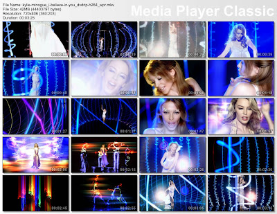
In the video for Kylie Minogue's single 'I believe in you' (URL above). I think the prop design and mise en scene of the piece would be interesting to encouperate in to my video. I like the way the light effects have been used to create interesting shape, such as the jellyfish image created out of coils of light strobes. Using a storyboard of kylie's video it is clear to see the effectiveness of the neon coloured lights:
Also feautered in this video is my origional idea of manequin style people dressed in lights dancing this also looks particularly effective and creates a techno/ dance feel to the video and a querky edge to the song. In contrast to my groups song which is angry and violent this song is light and airy this is shown through the use of colour (blues and purples) so we would have to consider colour changes and mise en scene.
Thursday, 1 October 2009

Initial brainstorming of ideas for the video

Mise-en-scene:
Costume and make-up:
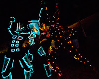
The costume we have discussed including in our video is quite simplistic visually although technically it will have some complex aspects to it. There are two main sections to our video the first being a narrative style sequence where a man is running through a desolate building searching or running from something and the other is of a group of dancers performing a routine. In the first section of video the man who is running will be topless as to heighten the intensity of the performance so the costume is limited to just a simple choice of trousers. However I think the routine would benefit from some facial make up design as to create a more forbidding atmosphere to the video. In the second sequence with the dancers we have planned to use UV Glow stix sewn on to dark clothing so when the dancers to their routine against a dark background it will create an interesting light effect similar to the one created in the image to the left of the text:
I think this idea is particularly effective and also in keeping with Bloc Party's dance / club scene.


Set and Location:
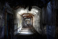
For the video two different locations will be needed also and our original ideas for these are as follows: Initially we had planned to film the running section in Hellingly, a closed down phychiatric ward as we thought this would create a well suited spooky feel to the video.
Looking at the image to the left sourced from the website , 'www.cpluv.com' it is obvious that this location would be ideal for the style of video we are trying to achieve, however there would be some issues with using it as some parts are restricted and the extreme dilapidation of the building could be a safety risk. I have found an alternative which is in Lewes near the college which would be more assessable and possibly more of an appropriate location. Although they will not be as eery with the use of lighting effects, the same outcome could be achieved. I have an idea however as a back up to take advantage of the location if we have to use the warehouse, which is to take images like the ones below(images sourced from http://www.tailcoat.com/ )and copy them to assatate and project them throughout the building. The images could be intensified following the beat of the music this would create an effect as if the images were chasing the runner rather then an actual person.

Props:
The props will be limited as most of the focas will be on set, location and costume, however If we have to use the warehouse as our filming set we will probably have to find some old wood and broken materials to increase the run-down look on the video.

Ares - Bloc Party

Ares Lyrics
War war war war I want to declare a war
My fist breaks your porcelain nose
There are other things that hands can do
To create or to destroy, mini gods and goddesses
First person singular
Set it set it set it off
War war war war
Keep the past the future is ours
Man made natural disaster
Blocking out all of the sun
Supermen and mitsi turbo
Speed agility
super strength
Wipe the blood of those knuckles
Spark it give me two’s on that
War war war war
I want to declare a war
True say blud that when we ride
We don’t stop for nobody
The Africans and the Bengalis
He knows all the rude boys
Reebok Nike Adidas Puma
“Rer rer rer, this shit is long”
It’s all getting, quite highly charged
Get out the way, or get fucked up
We dance to the sound of sirens
We dance to the sound
And to think, that these hands
Could work wonders, with their touch
Listening, to dead singers, in your room
In 98
We dance to the sound of sirens
We dance to the sound


Why I have chosen this song
These are the lyrics to Bloc Party's 'Ares'. This song has no current music video, however provides strong themes that could be translated in to an accessable format. A prodominant sence of rebellion and an ongoing protest dipicts the anger and violence that accompanies the song. Bloc Party also already have a defined audience, which makes it easier to target the video appropriatly.